Introduction
I only discovered flexdashboard
after delving semi-deeply into shiny and shinydashboard.
For the uninitiated, flexdashboard is an R package that utilizes shiny to
create dashboards.
(If you have never heard of shiny you can read up on it here)
I think what makes flexdashboard different from building a regular shiny app or shinydashboard
is that it is easier and faster to work with–at least in my experience. So
it is probably a better entry point for building dashboards in R than shinydashboard.
In this post, I am going to walk you through an example of building your very own flexdashboard
from scratch. We will use the quandl package to fetch current and historical data on
gold and silver prices, then display the value of a dynamic number of ounces of each inputed
by the user.
Before we get started, you might want to clone the Github repo for this project or view the finished app.
Getting Started
You will need to have R and RStudio installed on your machine. Also, make sure you
have shiny, flexdashboard, quandl, tidyverse, and scales installed. And because
we use quandl, you will need to sign up
for a free account and get an API access token.
The following code installs these packages:
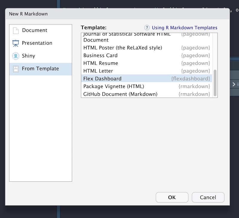
install.packages(c('shiny', 'flexdashboard', 'quandl', 'tidyverse', 'scales'))Then, whenever you want to create a new flexdashboard file, just click the
icon in the top left and select the flexdashboard template.
(You might need to restart RStudio if you just installed flexdashboard)

YAML
The top of the newly opened .Rmd file includes information on how to build the
app. You can set the title to anything you like, of course. The runtime
option is set to shiny but there are other options, such as
shiny_prerendered, that I won’t go into. Lastly, the output is where we tell
the machine we want a flex_dashboard with rows (instead of columns) and we
want rows to fill the screen (instead of scroll).
As a bonus, you can add a social media link and source code in the menu.
After you’re finished, it should look like this:
---
title: "Gold & Silver Portfolio"
runtime: shiny
output:
  flexdashboard::flex_dashboard:
    orientation: rows
    vertical_layout: fill
    social: menu
    source_code: embed
---
Setup
In the first code chunk we load the required packages, enable bookmarking (more
on that later), and set the Quandl API key. You can name this chunk setup.
If you plan on sharing your code or tracking it on github, then you shoudn’t
store the API token in your code. One workaround is to create a new file called
.Renviron in your project directory and in the first line add
QUANDL_API_KEY=api_key. Be sure to add .Renviron to .gitignore. Then, to
make sure that the environmental variable is available in the app use
readRenviron(). This is important if you plan to publish to shinyapps.io.
Note also the code that enables bookmarking. This is a cool feature in shiny
that allows users to store the state of the dashboard in the URL which can be
restored at a later time.
library(flexdashboard)
library(shiny)
library(Quandl)
library(scales)
library(tidyverse)

readRenviron(".Renviron")
shiny::enableBookmarking(store = 'url')
Quandl.api_key(Sys.getenv('QUANDL_API_KEY'))
Load Data
Next, we load the data from Quandl. The first two lines query the Quandl servers, and the rest of
the code extracts and reshapes.
Because data only need to be loaded once, this step shouldn’t
be repeated each time a graph or other output is re-rendered. To ensure that this step is run
only once during app start-up, we name this chunk global. In this tutorial, we focus on
gold and silver, but Quandl has data on stocks and other assests as well.
gold <- Quandl("LBMA/GOLD")
silver <- Quandl("LBMA/SILVER")

gold_current <- gold$`USD (AM)`[1]
silver_current <- silver$USD[1]

portfolio <- merge(
  gold,
  silver,
  by = "Date",
  all.x = TRUE,
  sort = FALSE
)
Define Inputs
Now for the meat and potatoes!
To make things simple, all inputs are placed in the sidebar.
Each row in the dashboard is defined by a level 2 markdown header (——————) and
each column within a row is defined by the three hashtags at the top (###).
We add a sidebar with .sidebar and set the width to 20% with
data-width=200. (The total width is 1000, so 200 is 20%)
Inputs {.sidebar data-width=200}
-----------------------------------------------------------------------

###
numericInput(
inputId = "gold_oz",
label = "Gold (ounces)",
value = 0,
min = 0
)
numericInput(
inputId = "silver_oz",
label = "Silver (ounces)",
value = 0,
min = 0
)
radioButtons(
inputId = "combine",
label = "Combine Values in Plot",
choices = c("Yes" = TRUE, "No" = FALSE),
selected = FALSE
)
hr()
bookmarkButton(class = "btn-link")There are three inputs here. The first two are used to define how many ounces of silver and gold the user has in his portfolio, and the final input is a yes/no radio button to combine lines in the plot created later.
In the last line, we add a bookmark button that triggers bookmarking. Once clicked, a modal will pop up with a URL that can be used to restore the current state of the dashboard.
Current Portfolio Value
Since we are done with the sidebar, we need to create another row.
Current Value {data-height=100}
-----------------------------------------------------------------------
The goal is to display the current value of gold and silver (and total value)
in the portfolio using the valueBox function from
flexdashboard. To ensure that each value box gets its own column, use the header
syntax again (###) above each new code chunk.
renderValueBox({
  valueBox(
    value = dollar(round(input$gold_oz * gold_current + input$silver_oz * silver_current)),
    icon = "fas fa-coins",
    caption = "Total Value"
  )
})
renderValueBox({
valueBox(
value = dollar(round(input$gold_oz * gold_current)),
icon = "fas fa-coins",
caption = "Gold Value"
)
})renderValueBox({
valueBox(
value = dollar(round(input$silver_oz * silver_current)),
icon = "fas fa-coins",
caption = "Silver Value"
)
})The valueBox function is wrapped inside the renderValueBox function so that the value box
is properly scaled to the size of the browser window. The value argument to valueBox is the
main content displayed. In this case, the value argument is set to
the number of ounces of gold and silver
inputed by the user multiplied by current prices fetched from Quandl.
The dollar function
comes from the scales package and adds the dollar sign formatting. Also, the icon argument
specifies an optional icon to be displayed in the value box. If you don’t like the one I
selected, you can find another one here.
Portfolio Value Over Time
The value boxes display the current value of your precious metals holdings, but what about the historical value?
The final row graphs the total value of gold and silver over time with ggplot. When the app
first loads, both the silver_oz and gold_oz inputs are set to 0 and the plot should be
empty. The first line of code inside renderPlot ensures nothing is plotted when
both inputs are 0. If either of the inputs are non-zero, a data frame is created with the date
and total value by metal. The data are reshaped long with gather.
If the user opts to combine the gold and silver line graphs, we need to collapse sum
the value column by date. If the user does not opt to combine (the default), then the total gold
and silver value over time is plotted separately by setting color = source. You can choose the
colors for gold and silver with scale_color_manual.
The last bit of code adds a lower limit (no negative values)
and formatting to the y-axis to make it prettier. I’m a fan
of theme_minimal() and use it for all my plots created with ggplot. Finally,
the two arguments passed to
theme() turn off the legend title and increase the text size. Make sure to call
renderPlot({
  if (input$silver_oz == 0 & input$gold_oz == 0) return()
  portfolio_value <- data.frame(
    "gold" = input$gold_oz * portfolio$`USD (AM)`,
    "silver" = input$silver_oz * portfolio$USD,
    "date" = gold$Date
  ) %>%
    gather(key = "source", value = "value", gold, silver)
  if (input$combine) {
    portfolio_value <- portfolio_value %>%
      group_by(date) %>%
      summarise(value = sum(value))
    p <- ggplot(portfolio_value, aes(x = date, y = value))
  } else {
    p <- ggplot(portfolio_value, aes(x = date, y = value, color = source)) +
      scale_color_manual(values = c("gold" = "#f5b342", "silver" = "#C0C0C0"))
  }

  p +
    geom_line(size = 1) +
    scale_y_continuous(
      limits = c(0, NA),
      name = "Total Value",
      labels = dollar_format()
    ) +
    scale_x_date(name = "Date") +
    theme_minimal() +
    theme(
      legend.title = element_blank(),
      text = element_text(size = 16)
    )
})
Deploy
You can create a free shinyapps.io account to deploy
the dashboard to the wild wild web. After you create an account, install the rsconnect
package and click the
blue publish button (next to the run button) in RStudio and you’re done! The free account
does have limits that you can read about at the link above.
Conclusion
You should now have a fully functioning app to track your gold and silver portfolio. Enter in your own gold and silver holdings and restore the state of the dashboard at any time by creating a bookmark.
I hope you enjoyed this post! Please let me know what you think in the comments below.